This is the eighth post in my series of daily posts for the month of April. To get the best of my writing in your inbox, subscribe to my Substack.
Managing social media use is ultimately about managing emotions. I’ve written about emotions before, so for this post I’ll just be sharing the specific tools and strategies I use to manage my social media consumption.
Custom CSS is your friend
I usually go to a given social media app for one of two reasons: to accomplish a certain action (e.g. search for a tweet, or DM someone to make plans), or to passively consume content (browse feed).
I’ve written a bunch of CSS so I can cleanly separate between these two uses: I want to be able to go to Twitter/Instagram/Messenger etc and actually complete the task I originally intended to do without getting distracted. So basically, I hide inboxes and feeds as much as I can.
For example, my Twitter home page looks like this:
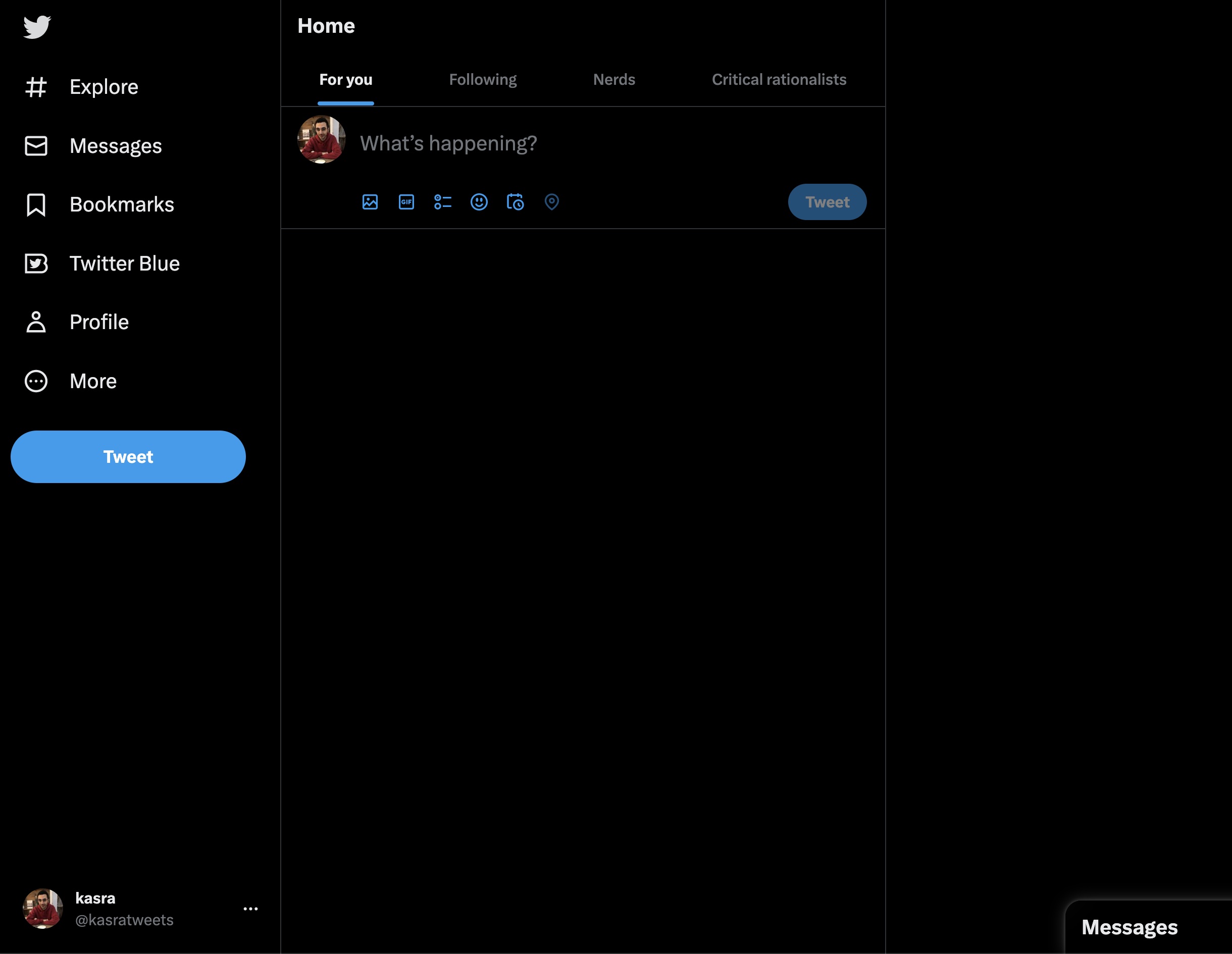 Literally everything except actionable buttons are hidden
And my explore page:
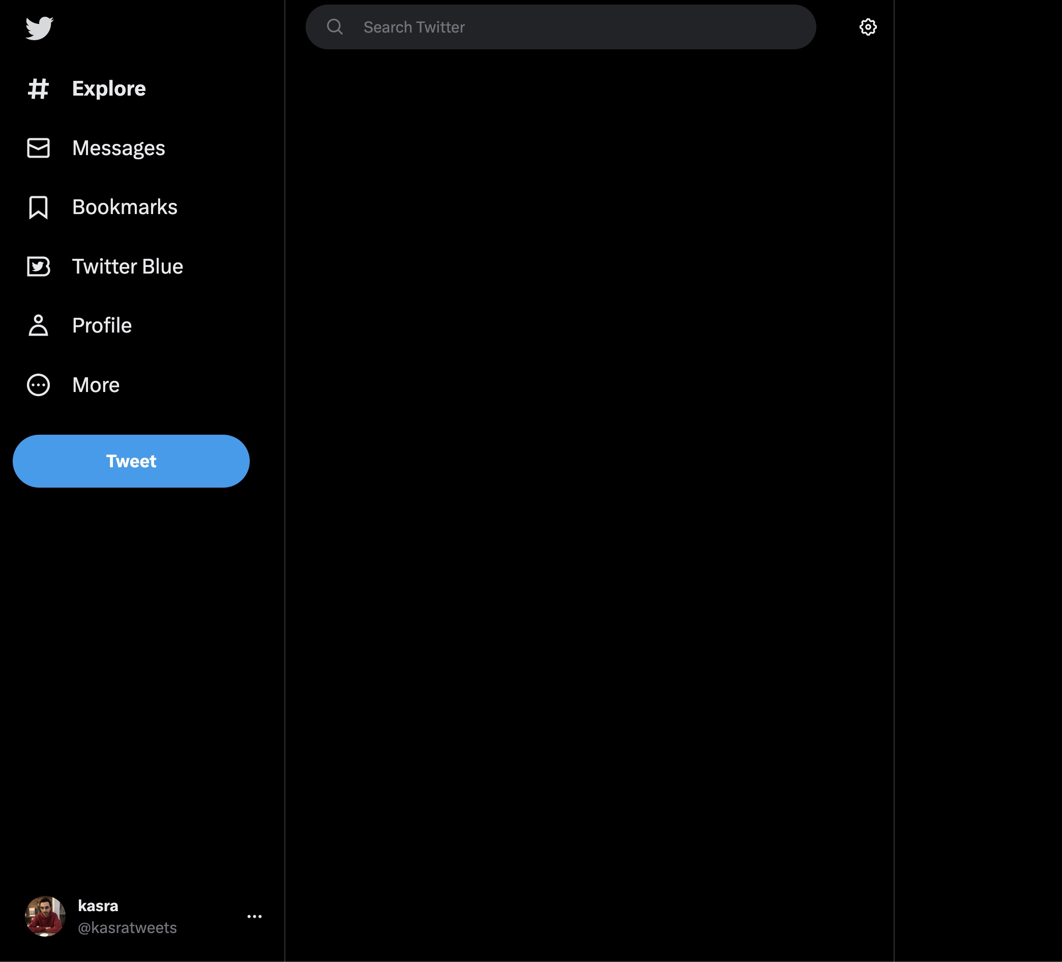 Removed trending topics, suggestions, etc
You can add custom CSS to any website on Chrome using the Stylebot extension. I’ve been using it for several years now and highly recommend it. You can see the full CSS I use for Twitter and other websites in the appendix.
I have a similar approach to other apps like Messenger. I often want to open Messenger to text a specific person about something, so by default I have the inbox hidden:
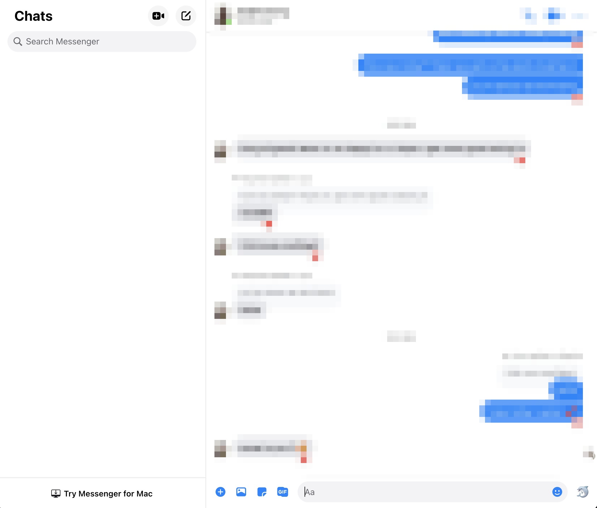 Hiding the inbox on Messenger with custom CSS
The CSS for this one is straightforwrd:
div[aria-label="Chats"] {
  display: none;
}
The convenient thing about this is that you can toggle to show/hide the inbox if you want to see it, and all the other functionality on the app (search, etc.) still works.
Same deal with Instagram:
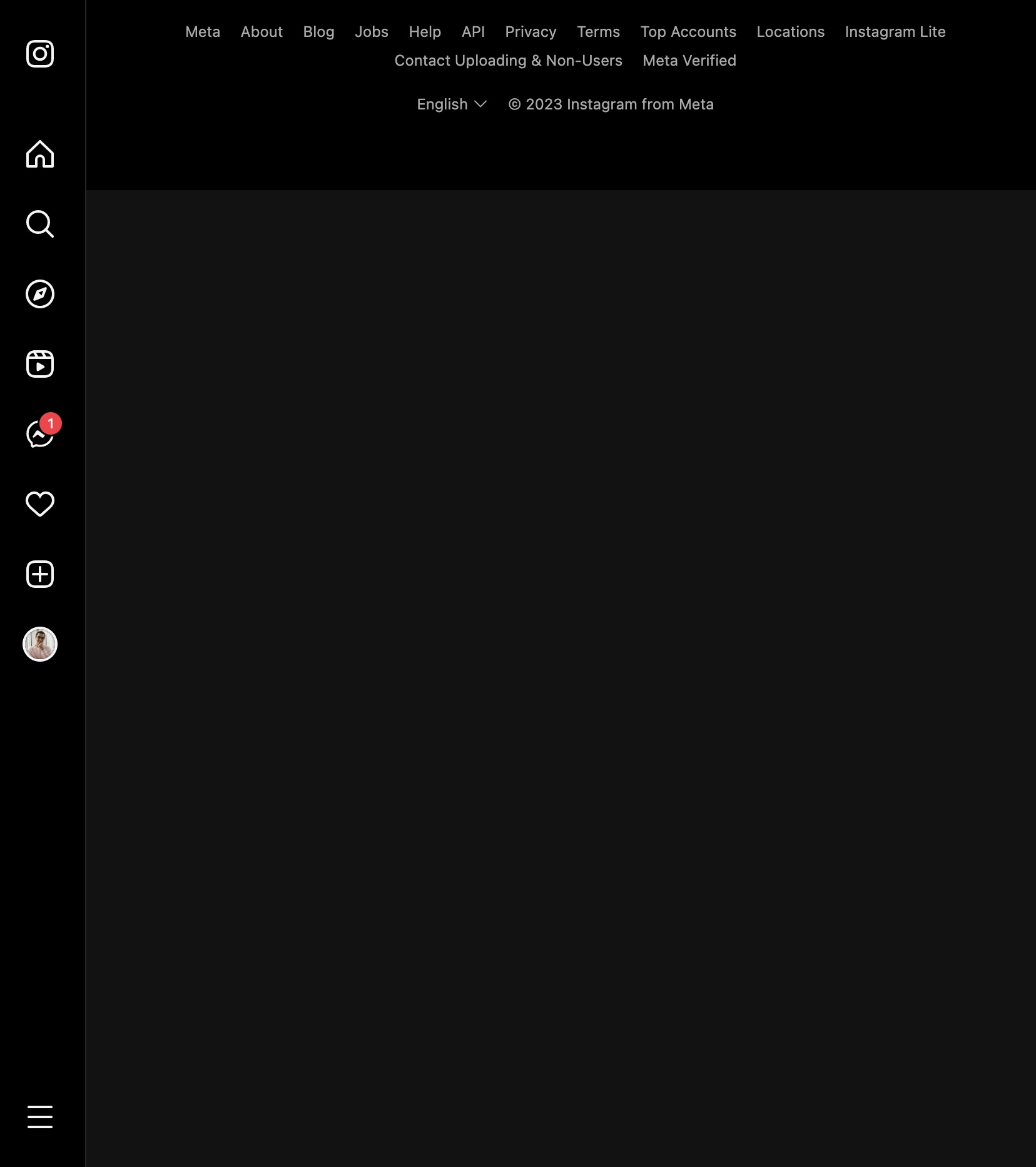 The main feed on Instagram hidden
Balancing mobile and web usage
All of the above is only helpful, of course, if you actually restrict your usage of these apps to the web. I basically separate out the “active” / “intentional” use case to my laptop, and then do all the passive scrolling on my phone, which I can limit with timers.
Screen time and downtime on iOS
Downtime on iOS was a gamechanger when I discovered it. In downtime mode, you basically turn off access to (and notifications from) all apps except a set list of exclusions. I have pretty much all my social media apps and Gmail disabled during downtime and have a pretty intense downtime schedule:
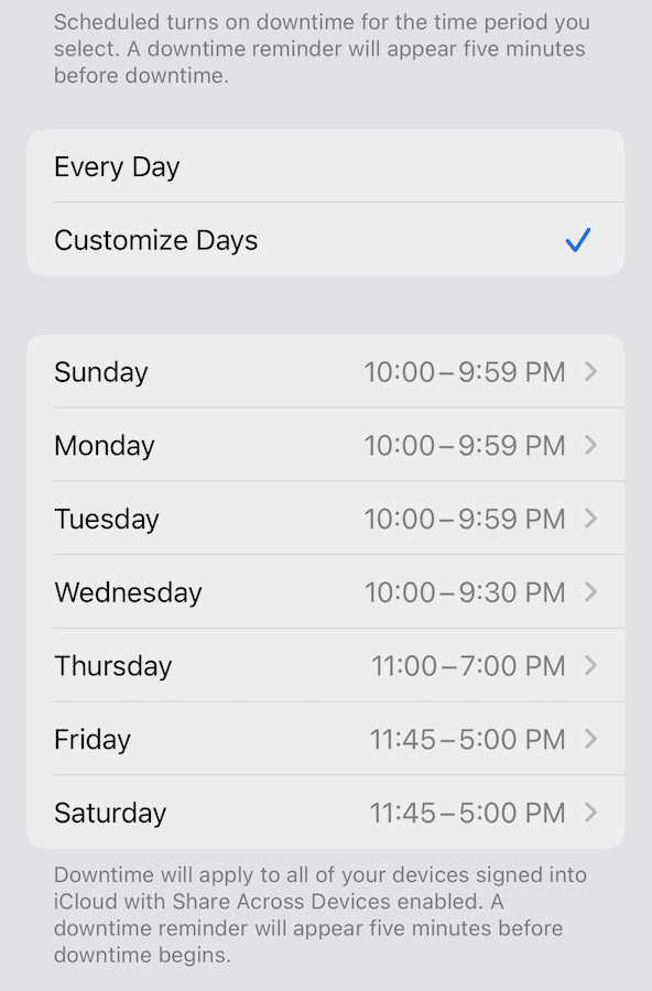 My schedule for downtime
Effectively Monday and Tuesday are completely off social media. That said, I do sometimes “cheat” – I’ll open Messenger in particular if there’s someone I want to call or make plans with, etc. But for the most part I’ve stuck to this schedule in the past few months.
As for specific time limits on apps: right now the only app I have a limit for (which is also the only app I have a propensity to overconsume) is Twitter. At the moment my limit is 20mins; in the past it’s been lower or higher, but this feels like a stable equilibrium for now. For the last week of March, my day-by-day usage of Twitter on my phone was 7m, 27m, 16m, 6m, 46m, 10m, and 10m. Last week it was: 17m, 16m, 1m, 29m, 62m, 16m, 23m. So, you win some you lose some.
Youtube: Distraction Free Youtube extension
This extension on Chrome is really great. I can’t remember the last time I actually looked at my YouTube home feed. The extension hides literally everything: suggested videos in the sidebar, the homepage, and so on. You just get the videos you actually search for / subscribed to / navigated to.
When there’s a video I want to see, I save it to my Watch Later playlist. Right now I have 101 videos there. I don’t expect that I’ll get through everything, but it’s useful as a container for videos I want to watch. There’s a lot of really fantastic stuff on YouTube if you don’t get totally lost in the algorithm.
A few of my favorite channels: Veritasium, The B1M, Theories of Everything with Curt Jaimungal, PBS Spacetime. But also, most of my YouTube recommendations come from Twitter.
Typefully for writing tweets / threads
I often have an idea for a tweet, or I want to write out a whole thread, but don’t want to open up the Twitter app and get distracted. (Even with hiding the feed and so on, I find it’s still very tempting to browse around, etc.) So I use Typefully. It lets you save a bunch of drafts, write out tweets with images and embeds, all without any of the noise of the actual Twitter app.
Airplane mode at night
All right, this one might sound extreme, but on top of Downtime and Do Not Disturb being on, I often set my phone to airplane mode at night. This was a habit that started after my meditation retreat – I found that ten full days of being on airplane mode didn’t cause any problems, so why not do it every night?
This act is more symbolic and ritualistic than anything. It’s making it so that there is literally no way I can be interrupted. And honestly having done this most nights for the past ~8 months, I can’t say I’ve missed anything truly important. Instead I’ve gotten a ton of peace of mind every night when I know I’ll no longer be using my phone.
Not opening notifications until noon or later
This one comes and goes for me in seasons. I’ve had long stretches (weeks to months) where, not only do I have my phone on airplane mode at night, but I don’t take it off airplane mode until later in the afternoon the next day. I especially try to avoid opening it up first thing in the morning.
The idea is to keep my morning quiet. To keep my mind focused on the most important things at the beginning of the day (reading, writing, journaling, meditating).
But as I said, I go back and forth on this one. Last week I was very consistent, this week I haven’t been, and I don’t feel bad about it. I modulate this based on what seems necessary at the time. Sometimes I can just sense that my brain has started to get overwhelmed (I’m less able to focus, or just not feeling great) and so I re-engage hermit mode.
I’ve also done home retreats where I stay on airplane mode for a whole day, and I recommend that too:
gonna try to do an at-home silent retreat tomorrow! this is the intended schedule pic.twitter.com/Tp7W61EABY
— kasra (@kasratweets) October 15, 2022
Separate curation from consumption
I recommend Andrew Conner’s post on this:
And this is the key that will lead to the solution: you must separate curation from consumption. The default experience of content consumption pairs curation and consumption directly together. This is bad. It’s the informational equivalent of putting you in front of an all-you-can-eat fried food buffet if you’re trying to eat healthier.
Twitter demetricator
I thought I’d mention this one since a lot of people benefit from it. The Twitter demetricator extension lets you hide all metrics on tweets and profiles. I tried this out for a while and found that I often toggle it off because I’m genuinely curious how a given tweet (and the comments on a thread) are performing, but YMMV.
Appendix: custom CSS on various websites
I use the Stylebot extension to add custom CSS to website on Chrome.
Messenger:
div[aria-label="Chats"] {
  display: none;
}

/* This second style I added more recently to hide the little bar on the far left with a bunch of icons. */
div.x9f619.x1n2onr6.x1ja2u2z.x78zum5.xdt5ytf.x2lah0s.x193iq5w.xeuugli.xycxndf.xkhd6sd.x4uap5.xexx8yu.x18d9i69 {
  display: none;
}
Instagram:
main {
  display: none;
}
Twitter:
/*
notification button
*/
a[aria-label="Notifications"],
a[data-testid="AppTabBar_Notifications_Link"] {
  display: none;
}

/*
home button
*/
a[aria-label="Home"],
a[aria-label="Home (New unread Tweets)"],
a[data-testid="AppTabBar_Home_Link"] {
  display: none;
}

/*
trending & timeline
*/
div[aria-label="Timeline: Trending now"],
div[aria-label="Timeline: Your Home Timeline"],
div[aria-label="Timeline: Trending Now"],
div[aria-label="Timeline: Explore"] {
  display: none;
}

/*
follow suggestions
*/
div[data-testid="sidebarColumn"] {
  display: none;
}
Gmail
This one’s more for aesthetic purposes, just making the inbox cleaner:
.AO {
  height: 90vh;
  left: 0px;
  padding: 5vh 10vw;
  position: absolute;
  top: 0px;
  width: 80vw;
}

.aiw, .aeN, .aeH, .aKh, .aeG {
  display: none;
}

div[aria-label="Side panel"] {
  display: none;
}
The result looks like this:
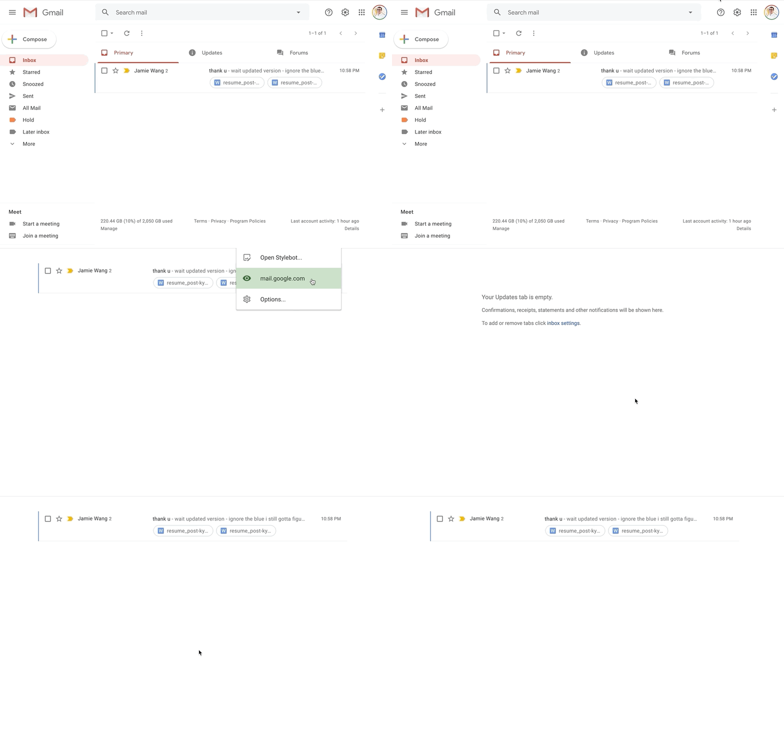 So much cleaner! And you can use keyboard shortcuts to navigate between tabs.
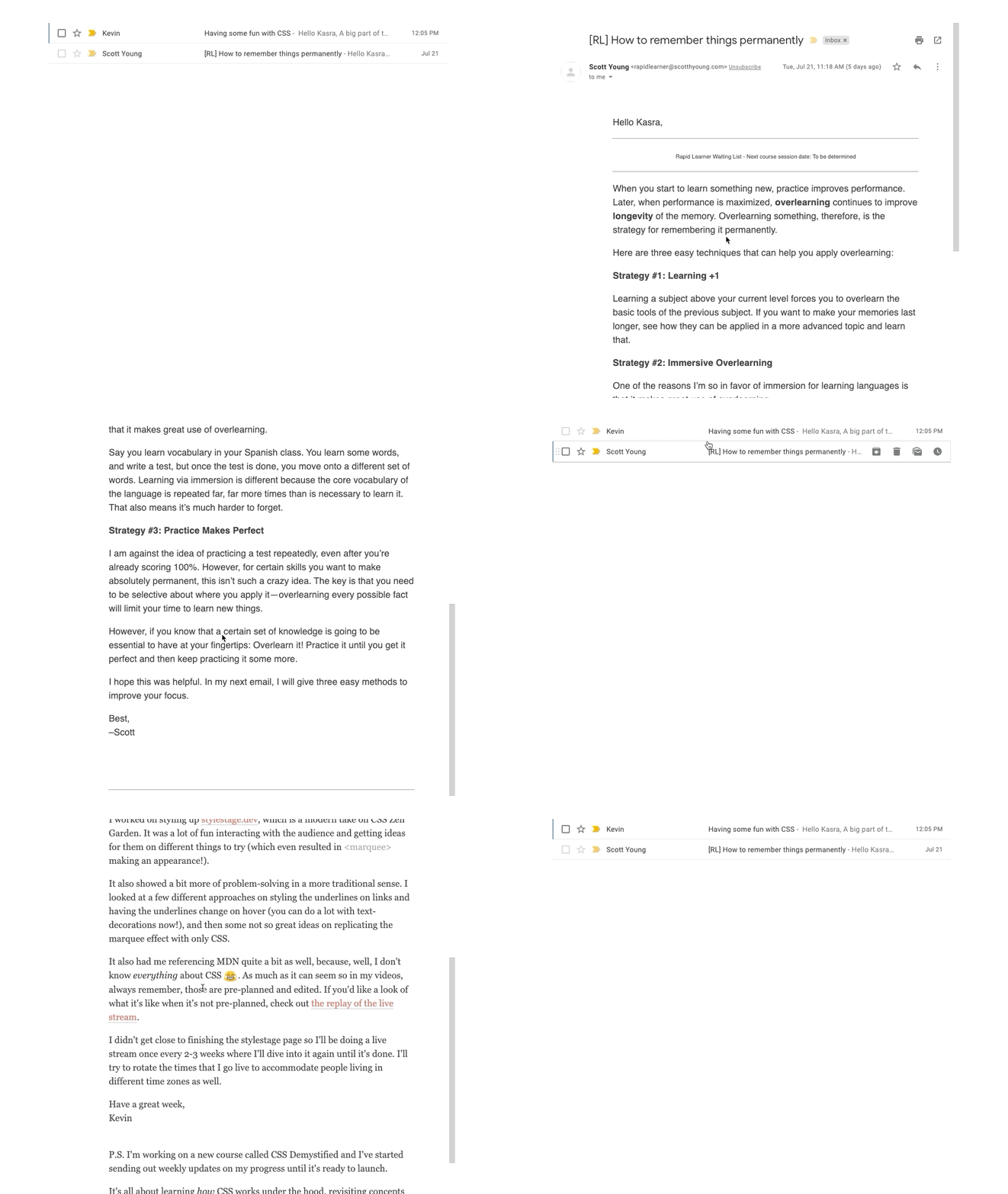 Reading emails is more pleasant too.
Google Keep
I also have this code on Google Keep, for blurring the background when you open a specific note:
div.VIpgJd-TUo6Hb-xJ5Hnf.XKSfm-L9AdLc-AHe6Kc.eo9XGd {
  opacity: 1;
}
So now when you open a note your Google Keep looks like this:
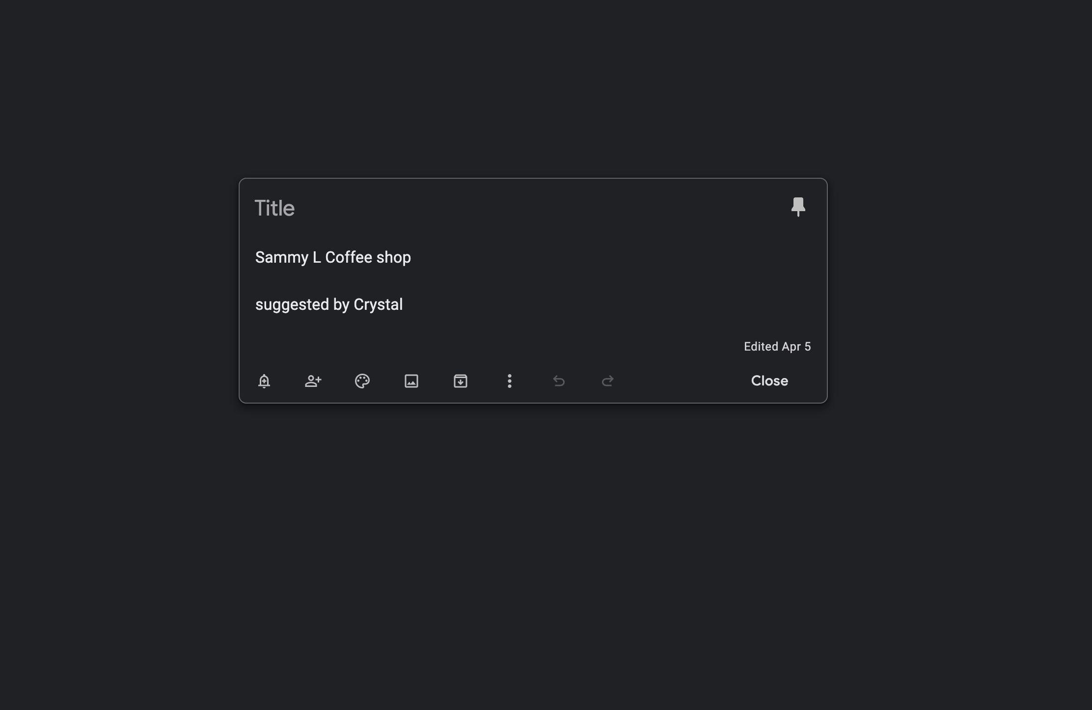 So fresh!! So clean!!
For more of my writing, you can subscribe to my Substack.